
Typography
These modular elements can be readily used and customized across pages and in different blocks.
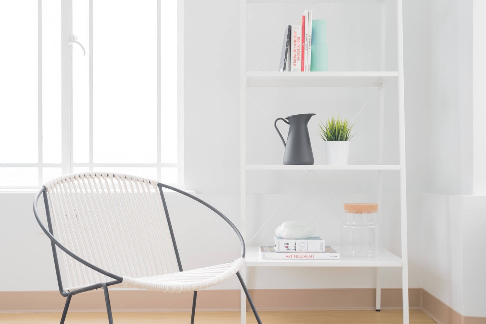
Explore all of Lapus's modular elements
at the
Element Index Page →
Modular Scale
Lapus uses a modular type scale combined with varying font weights to establish a functional and visually pleasing content hierarchy. By default, each heading pushes down one measure of the base line height (26px). This ensures that when constructing new elements, a consistent rhythm can be achieved.
Lapus uses EM units to ensure that typography and general spacing remain optimisied at different screen sizes and on different devices. Type and spacing scale down from a base font size of 14px, to 13px towards a mobile screen size. Try dragging this window down to the narrowest width to see the scale in action.
Heading Styles
Heading One
Heading Two
Heading Three
Heading Four
Heading Five
Heading Six
Lead Paragraph
视觉风格既简洁却又与众不同,无论您是基本的营销网站还是多页公司网站,它都是您项目的理想起点。
Standard Paragraph
视觉风格既简洁却又与众不同,无论您是基本的营销网站还是多页公司网站,它都是您项目的理想起点。
Typography Style Helpers
Lapus includes a number of helper classes to perform common type functions such as uppercasing, bold, italic etc.
- .type--uppercase - convert the element to uppercase
- .type--bold - convert the element to a heavier font weight
- .type--italic - convert the element to italic type
- .type--underline - underline the element
- .type--strikethrough - strikethrough the element
- .type--fade - fade the element to 0.5 opacity
- .type--fine-print - use the smallest text size in the scale
Type Uppercase
Type Bold
Type Italic
Type Underline
Type Strikethrough
Type Fade
Type Fine Print
Typography Colour Helpers
Easily adjust the colour of typographic elements by using the following helper classes:
- .color--success
- .color--error
- .color--primary
- .color--primary-1
- .color--dark
A successful colour
An error colour
The Primary Colour
The Secondary Colour
The Dark Colour